My role of leader
I designed an interactive global map incorporating features that encourage a high level of engagement with the end-user, including filtered searches and route calculation connected with the real-time benchmarked prices.
I have further enhanced the user experience and the interface of the products available for trading creating a shared library that supports the work of a traders team who share real-time information.

In a nutshell
It is a case study of a new disruptive market concept that connects all marine industry trading participants, designed to optimize price and fuel quality at acquisition time. Part of the midstream chain, it links the upstream and downstream divisions along the oil extraction path that involves many participants with different roles.

Review of problem
The initial product version was based on a 2-tier architecture created entirely by engineers, with no designer, based on Product Management and Client specifications.

Data
→ Data is modified several times in each step, either directly by user or via integration with other systems.→ Fragmented requirements around the globe.
→ Multi-layer processes require several levels of in-product navigation.
→ The information available in a number of other screens.
→ Make a decision based on current information available.
→ Operations delays (Vessel voyage & Quantity to buy).
→ Vessel voyage not fixed until the last minute.
→ Bunker prices volatility with no choice.
→ Most of the time does not take into consideration historic information.
Market conditions
→ User have personal preferences and cannot align to a common way of trading because of targets.→ Dependent on weather variations.
→ Operations delays (Vessel voyage & Quantity to buy).
→ Vessel voyage not fixed until the last minute.
→ Bunker prices volatility with no choice.
→ All trading risk must be authorized or defined within limits, but not strictly.
→ Approval is required at times.
→ Each base has its own rules.
→ Each supplier has its own conditions.
→ Each fuel type has its own parameters.
Objectives
Who are the users?

The challenge
The expected output of the Planning Dashboard was to be as follows:
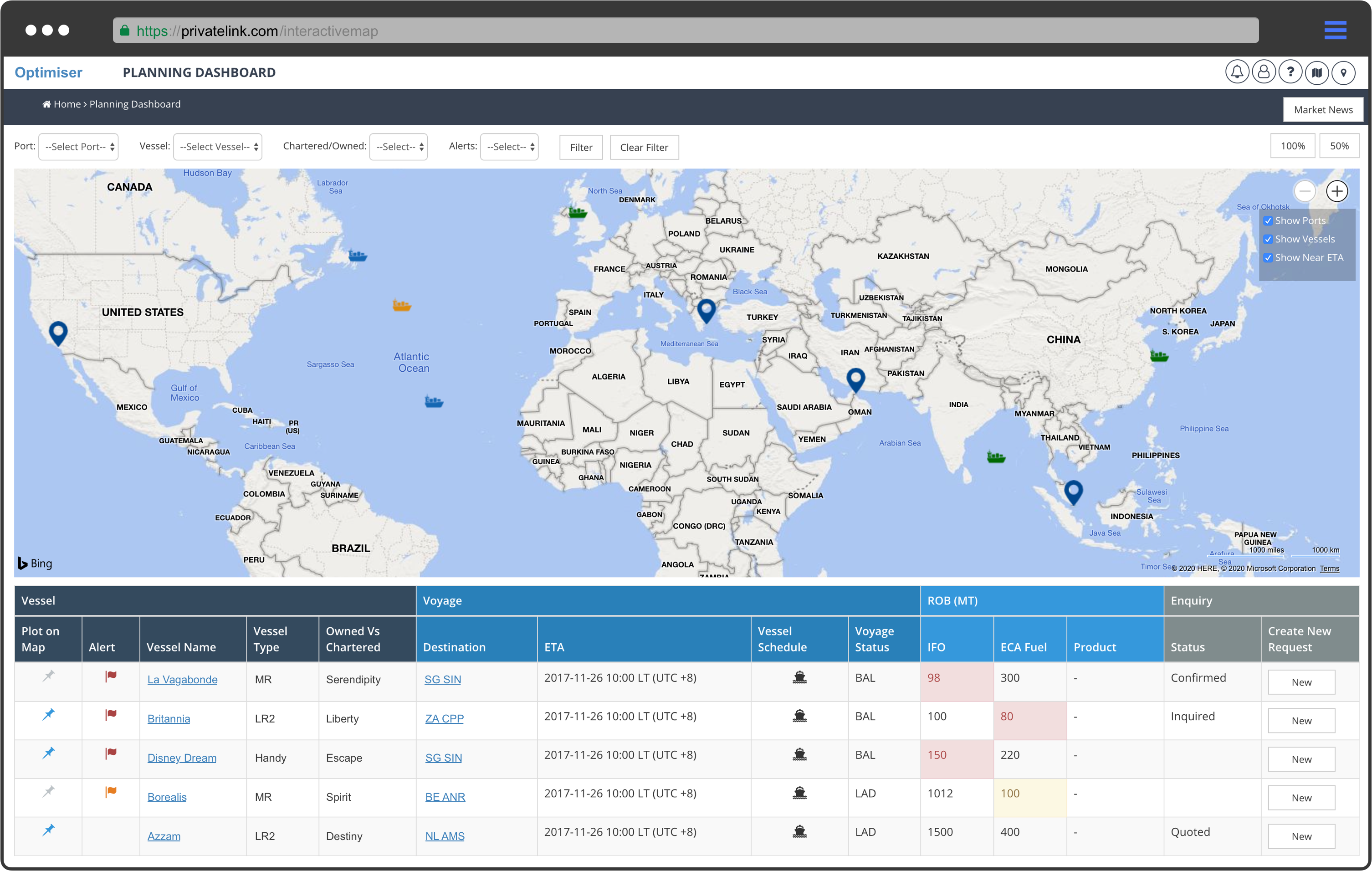
A World Map, on which the voyage/route of all the vessels are mapped port-by-port according to the schedule (calendar) as published by IMOS. All the information needed to be displayed on the map associated with each Vessel and Port combination.
Prioritize what should be seen
We collected all the data/ information structures needed, and defined the priority of display upon accessing the Dashboard together with the first action to take.

Audit/Empathy
Initially, to have a better understanding of the purpose of the planning dashboard we researched the information asking questions with the users (traders) and Subject Matter Experts (shipping experts).

After organising the data resulted from research, we performed an internal audit to collect behaviour data from current projects, highlighting the pain points hindering the application performance.

Color schemes from market and user perspective
Traders spends their working time on their transaction screens, typically 2 to 4 at any time.
We have analysed the options for background colours for the Dashboard, including researching our competitors, and have recommended a dark visual interactive map as the solution “for the readability and legibility” of the data used by the traders.
The color of the images feels deeper the general layout is more stylish and clearly is a differentiator from the competition.

What is the pain point for acceptance and adoption?
More experienced users with a lot of time spent in front the screens over the years are not ready to accept a darker theme, but we were convinced that all the above points mentioned will convince the stakeholder.
First outcome – The benefits of working with a strong counterparty
An extensive scene of the Dashboard has been designed and it is easy to observe that there is a lot of information to take into consideration.

First of all, from that degree of the zoom function and based on the current vessels positions, we are able to observe land and sea with different types of vessels and ports displayed, the counterparty selling the cheaper compliant fuel and today’s market prices.

Filtering
To improve the user need to see only a sequence of data, we designed the user experience including different types of filtering.

Starting from the top left corner, for instance, the user could perform a global inquiry in addition to determine the types of measure they want to create.
We had to consider that the user will make a decision based only on the current information available.
Thereupon, you can identify in the screenshot below from the first dark blue panel, that we have added different categories of selected ships based on vessel compliance status (created, planned, questionnaire, validated, inquired, quoted, stemmed).

By setting up what the users want appropriately, they can spot the chosen vessel by the status of the actual contract.
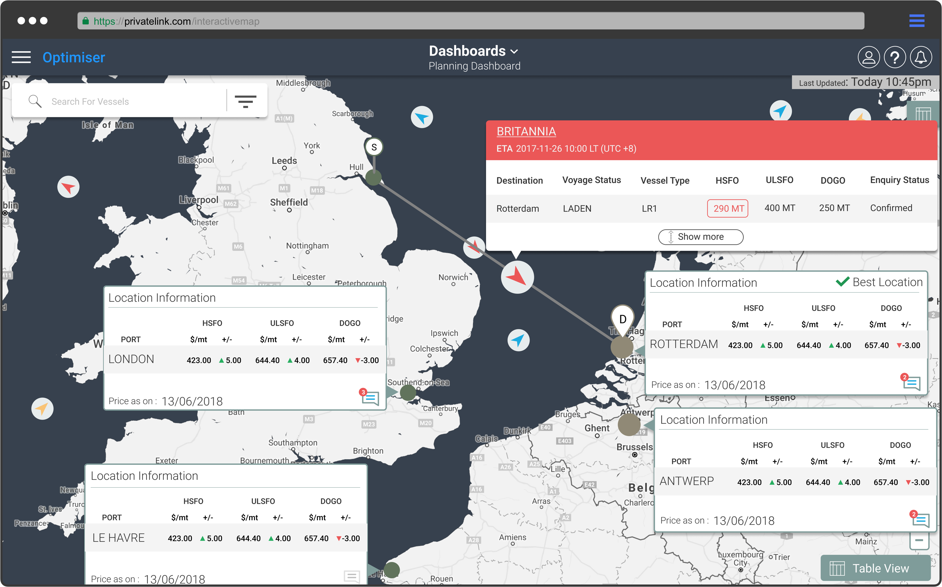
Route calculation
By clicking on a specific element, the map reorients itself to show more details of the vessel schedule.
This drill-down allows the user to control the specificity of data without being overwhelmed.
The trader can pan ahead to avoid a costly last-minute decision by showing off the best spot.

From extra challenges?
Another challenge was added to our pipeline of the tasks.
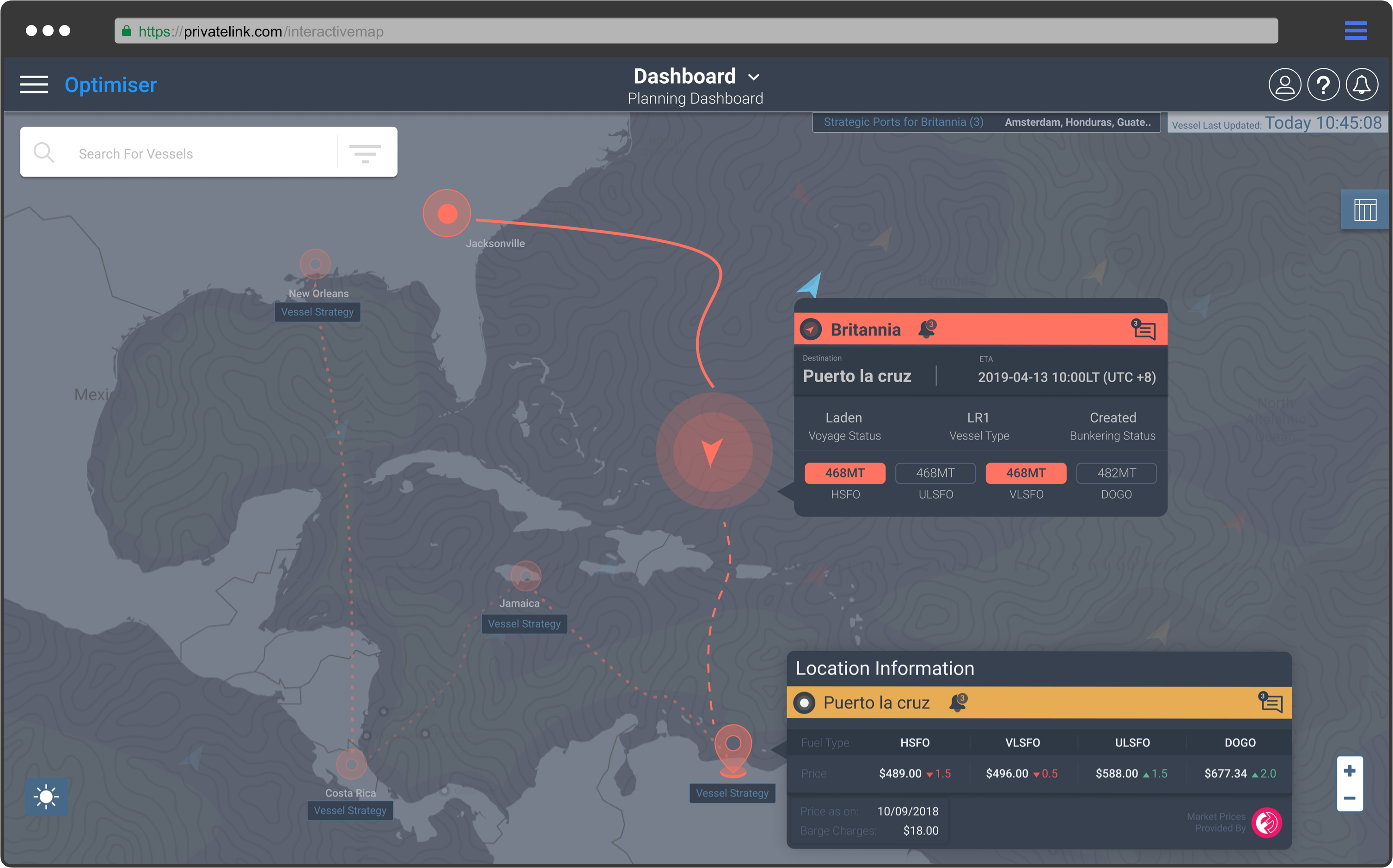
We had to identify how to manage the Bunker journey while minimising chances of loss?

By identifying and quantifying all the dangers that exist in the market and developing strategies that will protect the stakeholder from the many potential pitfalls.
Calibration
We used knowledge to create a powerful user experience.
By adding artificial intelligence optimisation algorithms, we correlated data about the voyage with data about consumption, tanks data and the buying strategy to project the best product/price combination .
Yet visually something was missing – We have started to notice loads of discrepancy on the trading instruments board, so I have decided to take the lead by aligning components and adding contrast along with rhythm.

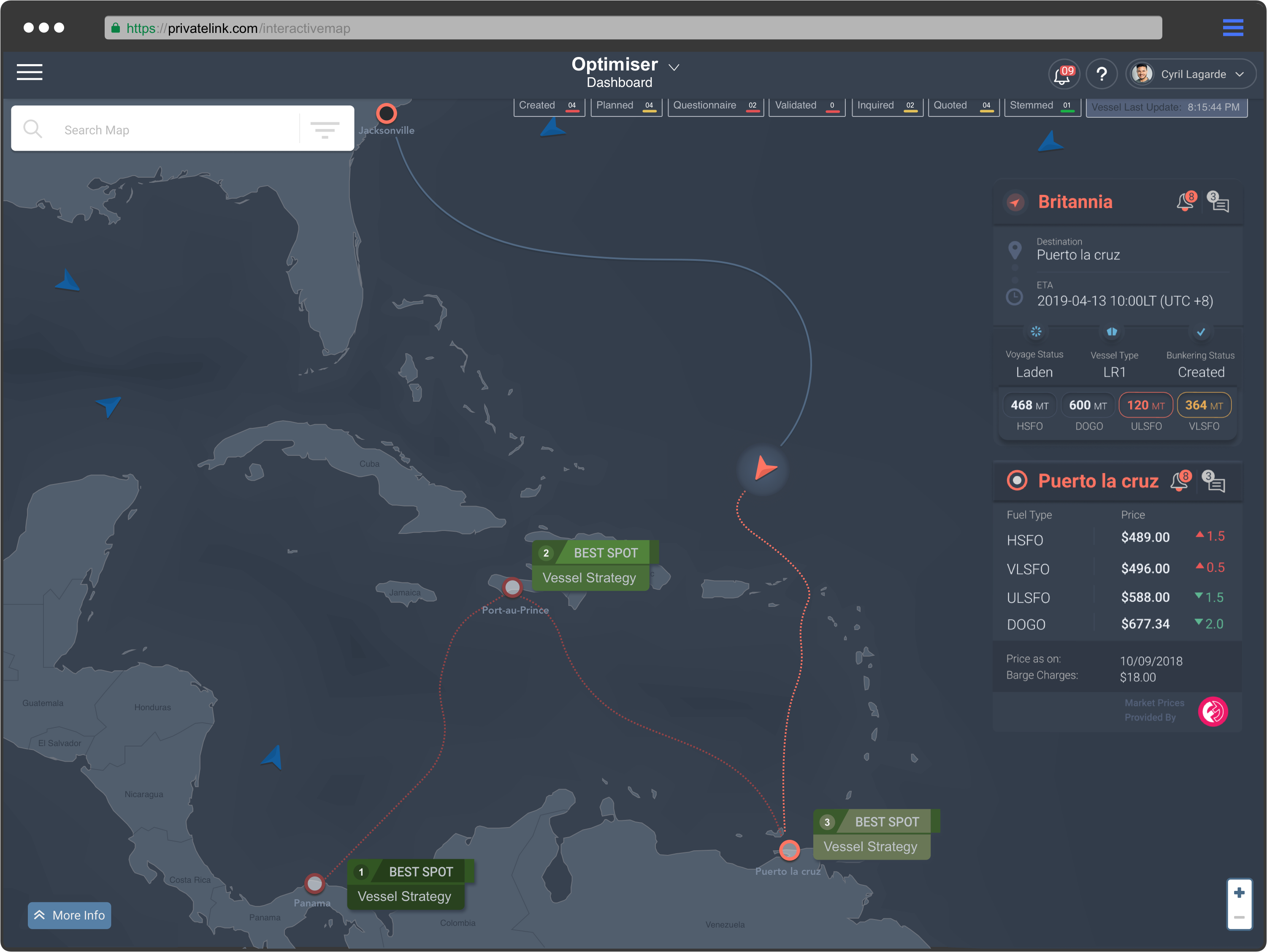
From the last challenge, it was clear Bunker strategy functionalities are one of the most important things on the screen, we had to make sure that the user will be able to spot what is the first and last best spot from their journey.

Equality
We have to pull-up all the built components from polished all the miss-alignment and add more contrast between the map and upper component.
Vessel Detail:

Blade navigation
We had previously used blade navigation on another product module (seen on Microsoft application).
From there we learned that we can avoid the cost of development and help simplify the screen usability. At the same time, we could retire much of the information that the end-users seldom use and keep active the one they would want to see on the screen.

Having said that, I had a preference to start showing ideas by sketching up different ways the upper element will behave on the top of the map.
From there you will see on the screen below the first outcome from team members of our interactive map.

A design system
It was the correct time in the process to start connecting all the design components simultaneously creating a new shared library, ensuring that any new design requirements received from the product team members would be updated at the same time.

Adding rules
One of the most important things to do is to show how the component is behaving. Having a final version of each component helped us to focus more on the user experience from the requirement given.
For instance, below are some artwork elements used most in different types of behavior.

Conclusion
I was enthusiastic leading the user interface design and helping team members build the user experience of this fantastic project.
The way the data needed to be seen from the user’s perspective was challenging. We had to keep in mind that the main user is constantly concerned about market price changes as the market is uncertain.
Building a map without following the main purpose of what we are designing for could create multiple unnecessary iterations.
For whom are we designing?
If it is only for a demo purpose, first of all we have to define what is needed into the screen.
How to proceed?
Design Tools
- Excel for research
- Figma for process and navigation flows
- Sketch, or even Illustrator for artwork it is a painful task and I do not recommend it at all.
First of all from the starting point, we have to define from our needs which tools are the correct one. Are we going to work with a third party ?
Google Maps API, Leaflet, Mapbox
I worked closely with the Technical Lead to ensure the design solution are feasible.
The most important thing while building an interactive map is present data that means the most to the user, effectively empowering the user as well as bringing an element of fun.