In a nutshell
Design workload increase managed in a shared library.
The back story
It is a complex and growing application created in 2003 by a parent company, Glencore.
I joined the team in 2017 and from there, I noticed that we had a significant amount of inconsistencies between the user experience and the visual across components and pages of the product.
I took the lead with a team of designers and developers by working closely with product management.
Problem.
Whilst we were building modules without having a proper style guide for team members, we were definitely wasting a lot of time.
Without having stylistic rules throughout, our list of inconsistencies were soaring. We had to take action and plan accordingly.
Who will be calling for?
We need to define who is truly the user and understand their current flow.
Developer

We were using old stylesheets of lines of code from 7 years of different developers which started to feel complicated to understand.
We were implementing similar functionality and component instead of reusing the current one.
From there, inconsistencies in the code was soaring and we had to re-check the code standard regularly.
Designer

While we were designing dozens of button styles, incorrectly applied font weights, and single-use icons were everywhere.
We were getting lost in those folders by recreating the same components most of the time.
At some point, we were starting to lose confidence in the middle of the project without making the right decisions.
Management

Before reviewing screens with stakeholder, we were having hundreds of incorrect shared links and still seeing the same issues unresolved from the previous meeting.
From creating that tension, it was a confusing and frustrating experience for each department.
Solution
From that effect, I have decided to take the lead and consult team members by proposing a new method of working by creating a new shared pattern library for the designer and other members of the team to meet our needs.

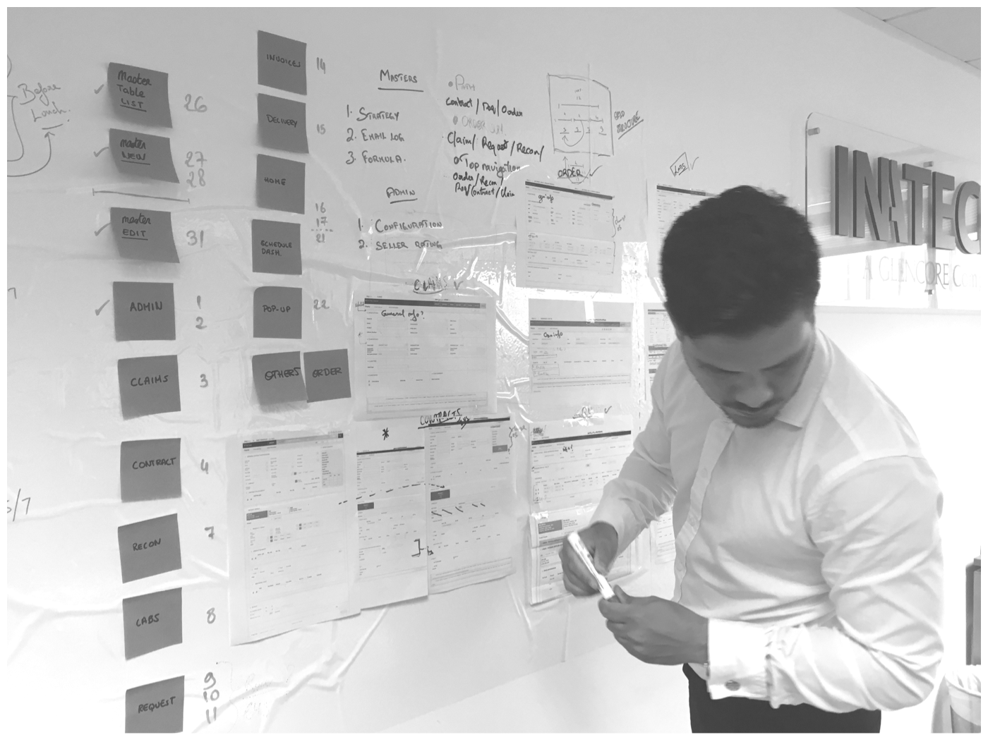
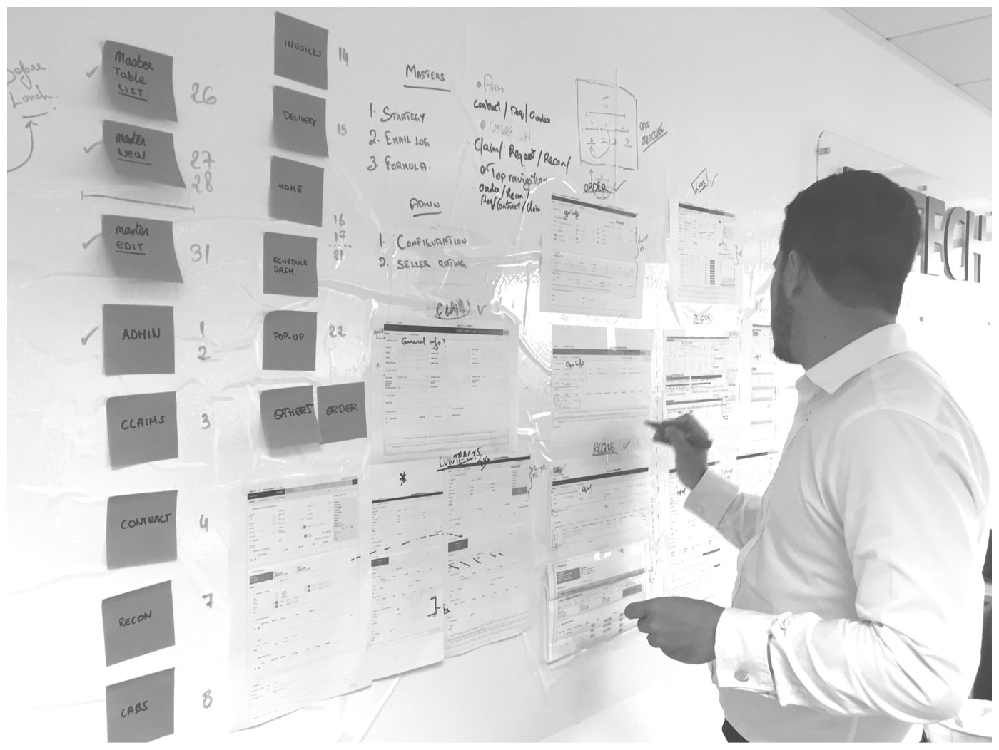
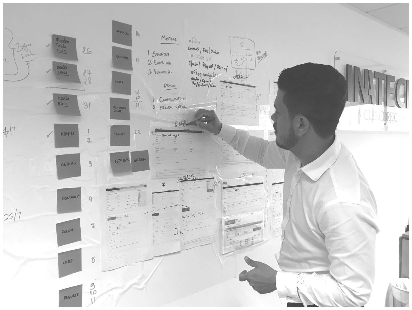
1 – Conduct an audit for all existing components
We had to explore our current application to have a better understanding of what specific contexts it lives in. From there we created an inventory which has helped us to establish the project scope and ensures that all components are accounted for so there are no unwanted surprises.


From there we have taken screenshots of the entire applications to do a proper audit and identify the pain points of what worked or didn’t.
2 – Add on harmony
Before
No consistency, no dominance all elements have nearly equal visual weight. It’s randomly scattered, nothing aligns with anything.

After
The icons work in context at the relevant sizes. Your eyes are immediately drawn to it. They work in harmony by having beautiful spaces.

3 – Include rhythm & contrast
Before
When there’s no clear dominance, no rhythm between elements, they compete with each other. We have a hard time focusing on things. Everything is competing with everything.

After
We have set our expectation by what the content is it about and we are purposely leading people from point A to point B on a screen. Dominance relies on contrast and contrast communicates hierarchy.

4 – I painstakingly recreated all screens in Figma

Having a view of all the screens in one place helps to expose unintentional inconsistencies and encourages consistent, deliberate design decisions. It was a tedious process involving spreadsheets and caffeine, but the hard work pays off.
5 – Empowering loading data
Excessive wait times reported by the user.
We needed to wait to see the entire data to load entirely and having a blank screen or spinner is perceived being longer in duration time.
Designing a waiting experience with a blank skeleton screen using motion while progressively populated content, such as data as they become available.

Conclusion.
A design system is an open library which will be never closed and as today, team members keep updating it as it goes. I have learned that creating a shared library will take time and money in the early process but will shine later.
From that hard work we will have:
Consistency, Reusable features, Easy to maintain, Easy to scale/Update, Easy to handoff/Training, Get into Details, More Empathy.
